Intro to the new responsive engine
Bubble's new responsive engine is out of beta! Here's how to use it

Hello fellow Bubblers,
Bubble recently announced that their new responsive engine is officially out of public beta! This means that all new apps built with Bubble will use the new responsive engine by default.
If you’ve not yet used the new responsive engine, this article is for you. It’s an extended version of a Twitter thread that I did at the beginning of the year. We’re going to cover the layout options that are available and dive into some examples that illustrate how one can use each layout.
Getting Started
Bubble’s new responsive engine is based on Flexbox; a system that helps you dynamically align and organize elements in a container. It makes container elements adaptive, which is where the ‘flex’ comes from. Containers can now expand or shrink themselves or the elements inside them, and can adjust the spacing between elements.
With Bubble’s new responsive engine, you can now modify the layouts of a container using the property editor. Previously, there was only one container layout - Fixed. However, with the new responsive engine, there are now 3 new layout options available: row, column, and align to parent. These are what will be covered in this article.
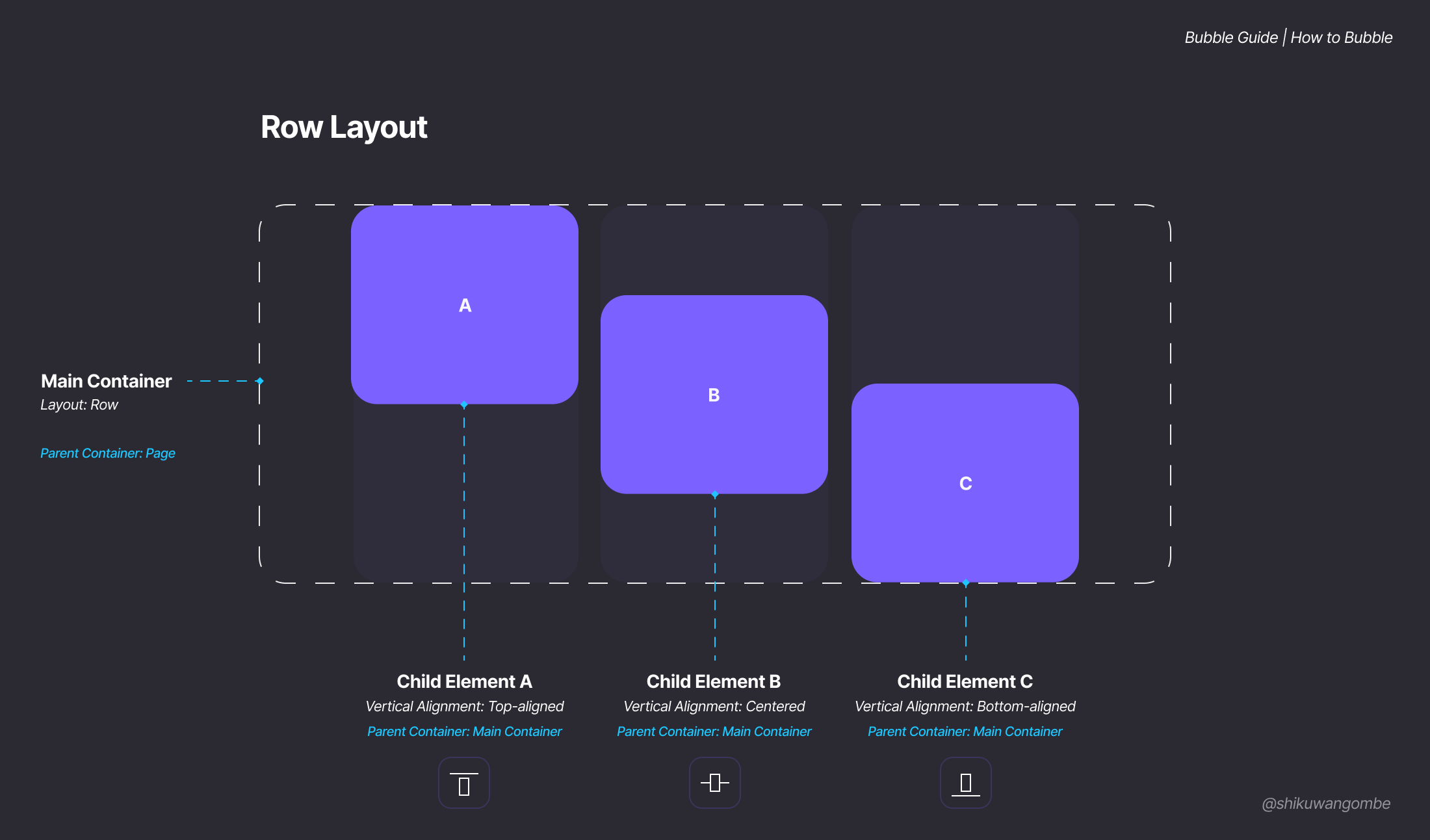
Row
When this layout is set on a container, it means that all the elements inside the container (also known as child elements) will be organized one-after-another, as in a row. Elements that are placed in a row container will have an option appear called ‘vertical alignment’. This lets you choose where in the row’s height an element is placed.
In the diagram below, the main container (also known as the parent container) is set to row. Using vertical alignment, you can choose where the elements inside the container are placed; at the top of the main container, at the center of the main container, or at the bottom of the main container. The vertical alignment is set on each individual child element.
When you set a container to the row layout, you can also determine the horizontal alignment of all the child elements. The diagram below highlights what each option would look like.
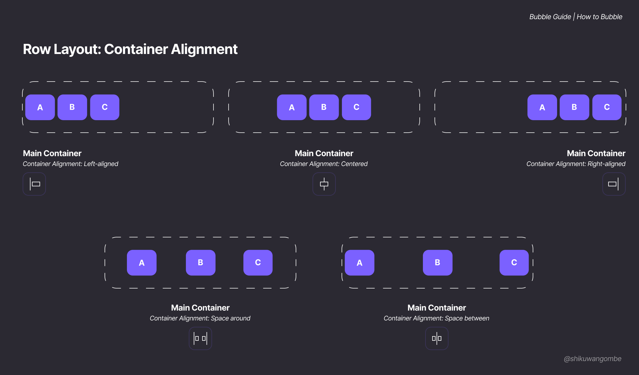
Left Aligned
This option sets all child elements to align to the left of the parent container.
Centered
This option sets all child elements to align to the center of the container.
Right Aligned
This option sets all the child elements to align to the right of the parent container.
Space Around
This option creates even spacing between each child element, and between child elements and the parent container.
Space Between
This option creates even spacing only between each child element, with the first and last element aligned to the border of the parent container.
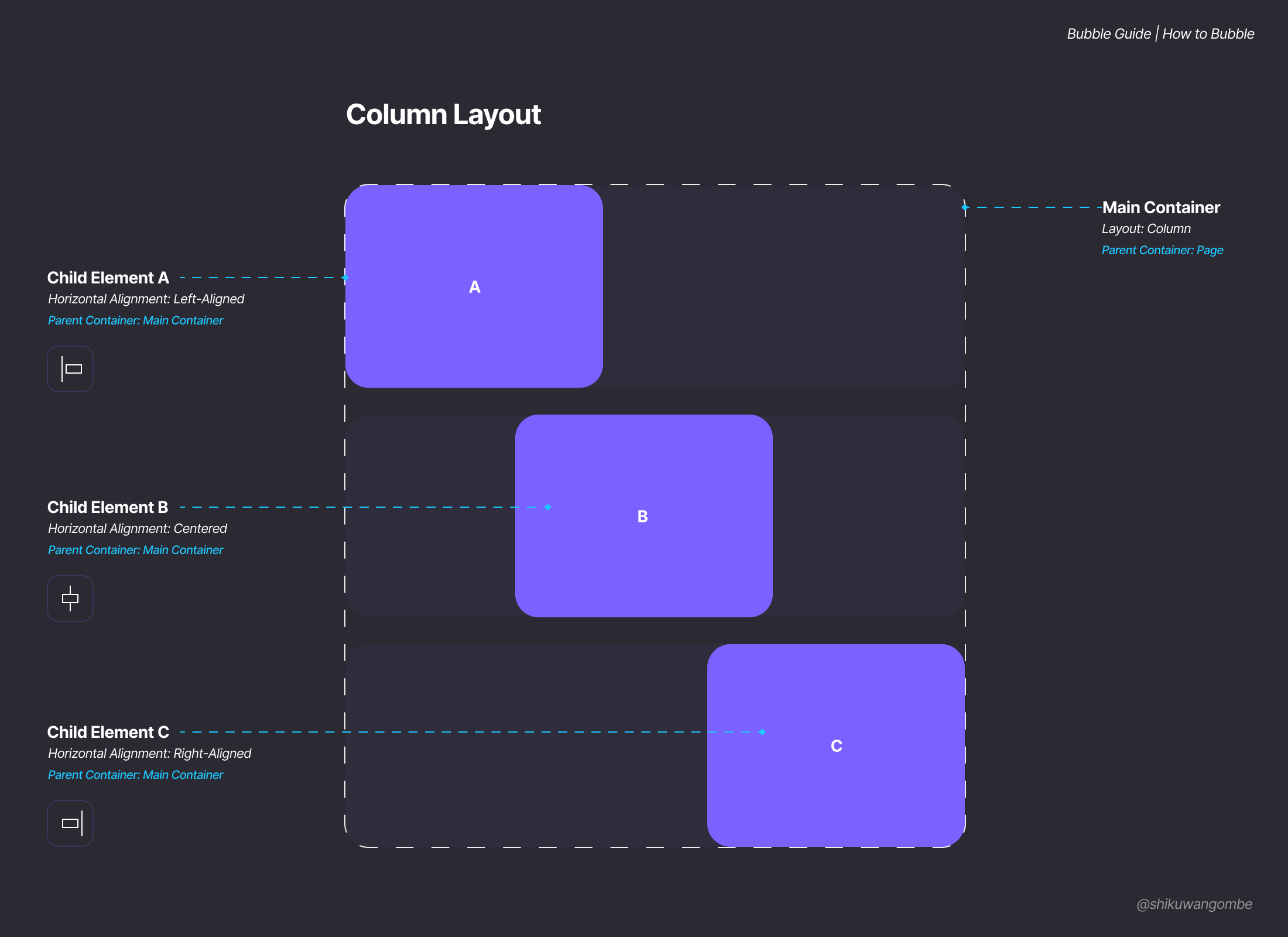
Column
When this layout is set on a container, it means that all the elements inside the container will stack on top of each other, as in a column. Containers that are set to a column layout don’t have a container alignment option. However, the child elements in a column container will have an option appear called ‘horizontal alignment’. This lets you choose on which side of a column an element is placed.
Spacing
When you set a container layout to Row or Column, you’ll notice a new checkbox appear in layout tab of the property editor labeled ‘Apply gap spacing between elements’. When this box is checked, you’ll have the option to apply row spacing or column spacing. Here’s how each of these works:

Align to Parent
Align to parent allows you to place elements in a specific section of a container. It essentially divides a container into a grid with 9 areas. Bubble refers to these areas as 'nonants' since there are 9 of them. (A smaller grid with 4 areas is called a quadrant. The use of 'nonant' refers to the fact that this grid has 9 areas) Elements added in a container with this layout automatically align to the nearest nonant.
To specify the placement of an element inside an ‘align to parent’ container, you need to click on the element, then choose its position.
While this layout can provide flexibility in how objects are placed, if objects are placed in the same nonant, they will lie on top of each other (not stacked, like a column, but overlapping). So be mindful of that.

Margin and Padding
At the bottom of the layout tab in the property editor, you’ll see two new sections labeled ‘Margin’ and ‘Padding’. Here’s how they work:


Layout Examples
To illustrate how these layout options could be used, here are some real-world examples that I’ve reverse-engineered using Bubble’s flexbox layout options.
YouTube


Youtube Thumbnail breakdown

Airbnb


I hope you found this article helpful and that it gives you some inspiration and courage to explore the new design engine. Feel free to drop any questions you may have in the comment section.
If you enjoyed the article or found value in it, please share it with others who you believe would find it helpful!
Happy Bubbling!
The layout examples look amazing! I am sharing this with my junior developers.
Great material, I've got more understanding on the new responsive engine.