Building a search modal in your Bubble.io app
A step by step guide to building a simple search modal in your app.

Hello Bubblers,
In this issue, we’re going to cover how to build a simple search modal in your Bubble app. I’ll be using a search modal design I created in Figma, which is publicly available for you to clone for free:

Access the Figma File
If you want to transfer this search modal into your bubble app in seconds, you can do so with How to Bubble’s newsletter sponsor, Deezign. Deezign provides instant, responsive Figma to Bubble conversion. Whether it’s a Figma design you built or a free UI Kit you found in the Figma marketplace, you can instantly convert it into your Bubble editor. Use code howtobubble at checkout for 20% off your subscription!
Getting started
To get started, click the link shared above to access the figma file we will use in this tutorial. With the file open, navigate to the resources button at the top left menu, then search for Deezign and select launch. If this is your first time using the plugin, you will need to set up an account. The app will then prompt you to create a token, which you can then paste into the token input in Figma.

The app will also walk you through the process of installing the chrome extension, which you will need when we move the Bubble stage.
Converting from Figma to Bubble.io
In order to convert the elements accurately, you’ll need to ensure that the elements in your figma file are converted into a format that the plugin will recognize. For example, if you have a text element on the page that represents an input, you will need to select the text, navigate to the Buttons/input tab in the Deezign figma plugin, then select ‘input’. If you are using the Figma file I shared, you may not need to go through this process since I already did this, but it’s worth checking as well.

Once you have all your elements appropriately assigned to a Bubble element, select the entire frame (in this case, ‘Search_Modal’), go to the ‘convert’ tab in the plugin, and click convert.
Building in Bubble.
If you have the Deezign chrome extension installed, you’ll notice the Deezign icon in the left sidebar. It’s a colorful icon, so you can’t miss it! Click on the icon, then login to your account.

Once you’ve logged in, you’ll see your Figma component loaded in the right sidebar.
For this tutorial, since we’re using a popup for our search, we’ll first add a popup element to the page. Be sure to remove any existing default formatting tied to the popup element - i.e. remove the background color and drop shadow. Next, set your container layour to row, with center alignment and remove ‘fixed width’.
Next, click on the copy button from your design in your Deezign sidebar, then right click in your popup element and select paste. Your design should appear in Bubble in instantly!

Structuring your Database
Since we’ll need to pull in data into the RGs for our search results, we’ll need to create some data types. Navigate to the data tab and add the following
Type: Document
Field: Name
Field-type: Text
Type: User
Field: Name
Field-type: Text
Type: User
Field: Recent-Docs
Field-type: Document [List]
Next, create some fake accounts - as many as you would like, but you don’t need many. You can do so in the App Data tab, by clicking on the button labeled ‘New entry’.

You can do the same for the documents data type. To make it easy to associate your documents to your users, you can label your documents according to the name of the user it’s linked to, e.g. Sam’s document.
Customizing the design
Next, navigate to the plugin tab. We’ll need to add a plugin to enable us to do a quick search. The specific plugin you should look for is labelled ‘Fuzzy search and autocomplete’ by Zeroqode. It’s free!

Now we can customize the design back in the design tab. In order to build our search, we’ll need to make some minor modifications to the design we imported. Since Deezign doesn’t convert elements into repeating groups (as of this writing), we’ll start by adding repeating groups to display the search results.
To start, under the ‘recent’ section in the design are two groups. These represent the results that should be displayed in a repeating group (RG). Add an RG in this section, then copy one of the groups from the design into the repeating group (you can delete the other). Make sure you set the opacity of the seperato to 0%, and remove the borders of the repeating group so the RG appears to be transparent. Repeat the same process with the groups under the ‘results’ section.
For the first RG under ‘Recent’, set the results to current user’s recent docs. This will reference the list of documents we created in the user data type. When a user clicks on a document, it will get added to this list.
For the next RG under ‘Results’ set it to search for documents. This will reference all the documents in the app.
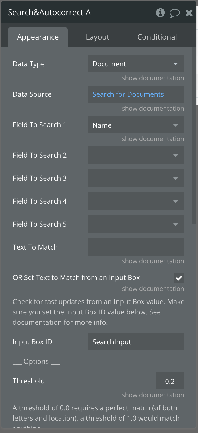
Finally, paste in the search and autocorrect plugin element in your popup. I place mine next to the input, right at the end, and change the dimensions to be as small as possible so it doesn’t affect the design. Set the data type for the plugin to documents and the field to search is the name. Next, check the box labelled ‘set text to match from an input box, and label the input box ID as SearchInput. Finally, click on the input and set the ID atteribute to SearchInput as well.
Conditionals
We will need to add conditionals to dictate when to display certain elements. For example, if a user has no recent documents, then the recent documents section should not be displayed.
Select the group that contains the recent docs repeating group and label (if you’re using the figma file, the default name will be Group: Frame 3. To this group, add the following condition:
When Repeating group recent documents first item is not empty
Next, select the property ‘This element is visible’, and make sure the box is checked.
What this means is that if the repeating group of recent documents has a document in it, this group will be displayed. Finally, in the layouts tab, uncheck the box This element is visible on page load, and check the box collapse when hidden. This means that this group will be hidden by default, and will only display when the condition we just created is met.

Apply a similar condition to the search results group, but in this case the condition should be as follows:
When Search&Autocorrect A’s Matches:first item is not empty
Then check the box for the ‘This element is visible’ property.
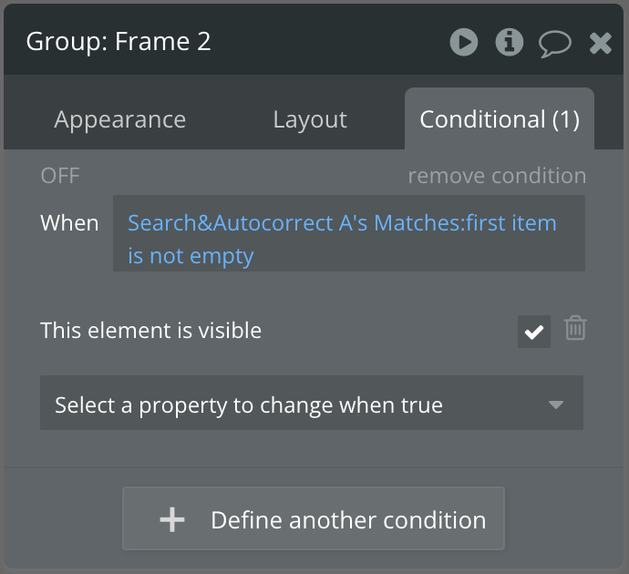
Finally, in the layout tab, uncheck the visibility checkbox and check the collapse when hidden checkbox, just like we did earlier.
Connecting it together with workflows
There aren’t many workflows needed for this design, but of course, you can add workflows that are appropriate to your app if you use this modal in your own project.
The main workflow we’ll add here is to the group in the search results repeating group. The purpose of this workflow is to update the current user’s ‘Recent_docs’ list whenever the group is clicked. To do this, select the group then start a workflow:
Action 1: Make changes to user → Recent docs: add current cell’s document
Action 2: Reset relevant inputs
Action 3: Reset input search & autocorrect
Action 4: Set focus to input ‘What are you looking for?’
Finally, I added another workflow on page load, with one action: to show the popup. You can also achieve this by adding a button to the page to trigger the popup to display. I simply used a page load workflow to avoid that.
And that’s it! You’ve now built a search modal for your app that can search through documents.
I hope you found this helpful! If you did, share this article with others so they can learn how to build with Bubble.
Happy Bubbling!
Shiku